What Contractor Websites Need That Generic Builders Can't Deliver
Templates and DIY builders structurally fail contractors. Here's what your website actually needs to generate leads, build trust, and win local jobs.

Picture this: a homeowner's pipe bursts on a Sunday morning. They grab their phone, search for a local plumber, and spend about six seconds glancing at two or three websites before deciding who to call. If your site doesn't immediately answer "are they licensed, do they serve my area, and can I trust them?", they're already dialing your competitor.
That split-second judgment is exactly why contractor website design is its own challenge, completely separate from building a website for a coffee shop or a boutique. Generic website builders and drag-and-drop templates are built for everyone, which means they're optimized for no one in particular, especially not contractors.
In this post, we're going to walk through everything a contractor website actually needs to do its job well. You'll learn why most contractor sites quietly lose business, how to display licenses and project photos the right way, why your service pages and quote forms need a rethink, and what it really takes to turn a visitor into a phone call. Let's get into it.
Why Most Contractor Websites Fail (It's Not the Design)
Most contractor websites fail because a visitor can't answer three basic questions within seconds: does this contractor do the work I need, do they serve my area, and have they done it before?
That's the whole problem. Not the color scheme.
Generic templates lead with a company mission, a hero image of happy people shaking hands, and navigation that buries actual proof two or three clicks deep. That architecture works for a software company or boutique retailer. It's the wrong structure for a trade contractor where a homeowner is deciding whether to pick up the phone.
Off-the-shelf builders optimize for flexibility across industries, which means they optimize for nothing in particular. Contracting has requirements those tools were never built to handle: license display, trade-specific service pages, geographic coverage, real project documentation. A template can't solve a structural problem it wasn't designed to recognize.
There's a real competitive opportunity here. The construction industry is significantly behind on digital marketing adoption. Many contractors are still running on referrals, yard signs, and a Facebook page last updated in 2021. A well-built contractor website creates genuine distance from that competition because the bar isn't high.
The core shift in thinking: a contractor website isn't a brochure. It's a direct-response tool. Its job is to move someone from "let me look them up" to "I'm calling them now," and every structural decision on the site should support that outcome.
License and Insurance Display Isn't Optional -- It's a Trust Requirement
Hiring an unlicensed contractor can leave a homeowner legally liable for injuries on their property, with no recourse if something goes wrong. That exposure is why license and insurance information is a fundamentally different trust signal than a five-star review. A testimonial tells someone you do good work. A visible license number tells them they're protected.
Most generic website templates have zero concept of this. There's no designated field for a contractor license number, no component for bond status, no placeholder for an insurance certificate. Those templates were built for bakeries and consultants, not regulated trades.
Where this information needs to live matters as much as whether it appears at all. License numbers and insurance status should be visible above the fold on your homepage, repeated on every service page, and present in the footer. Oregon and Arizona legally require license numbers to appear in all advertising, and your website qualifies. Burying it on an About page meets neither that legal bar nor the homeowner's bar.
The credibility case compounds quickly. Around 90% of consumers read online reviews before hiring a local service provider. When reviews appear alongside a clearly displayed license number and insurance status, you're building a trust stack that's hard for a visitor to argue with. Missing trust signals can push away up to 75% of potential leads, and for contractors, absent credentials are the single fastest way to trigger that exit.
Service-Area Targeting Has to Be Built Into the Page Structure
The next credibility test a visitor runs is geographic: do you actually work in their area?
A map widget doesn't do that job. Search engines can't read an embedded map, and a homeowner scanning your site on their phone isn't going to zoom in and check. Place names need to appear as actual text on the page so Google can index them and so a visitor can confirm coverage in a glance. "Serving Naperville, Aurora, Joliet, and the surrounding Chicago suburbs" does more work in one sentence than any interactive map widget.
Generic templates treat location as a cosmetic detail. You drop in a map, maybe a zip code, and call it done. There's no structure for what actually moves the needle: separate pages targeting specific cities or regions. A dedicated page for "roof replacement in Naperville" can rank for that exact search. A single homepage with a map widget ranks for your business name, if anything.
This matters more now than it used to. AI-assisted search evaluation rewards content that clearly explains what a company does and where it works. Vague service-area widgets are effectively invisible to that process.
The practical cost is simple. If a homeowner can't confirm you serve their zip code within 10 seconds, they leave. Better fonts won't fix that. A different template won't fix it either. The only fix is building geographic clarity into the page structure from the start.
Project Galleries Are a Sales Tool, Not a Portfolio
With location confirmed, visitors move to proof: have you done this work before?
A generic grid of stock photos actively undermines that. When visitors see images that look like they came from a photo subscription service, the immediate question is: did this company actually do this, or is this filler? For a contractor, that doubt is fatal.
Real project photography is one of the most visible credibility gaps between a template site and a purpose-built contractor website. Not your logo. Not your headline. Your actual work.
The structure of your gallery matters as much as the photos themselves. A chronological feed works fine for a design firm. A contractor needs something different: a gallery filterable by trade, service area, and project type. A homeowner searching for a bathroom remodel in their zip code should be able to filter to exactly that and see relevant results fast. That's a conversion tool. Most template gallery components have no architecture for it.
Before-and-after documentation is the format homeowners actually trust in this industry, and generic portfolio layouts have no structural support for it. They weren't built with that use case in mind.
Visitors decide whether to keep reading within seconds. Project photos that load fast and match what the visitor is shopping for, roofing photos on a roofing page rather than a generic construction montage, are doing active sales work. You can see examples of how project work translates into a site's visual language in our concepts and mockups.
Service Pages Need to Match How Buyers Actually Search
Not every visitor has the same need, and a single 'Services' page can't speak to all of them.
Multi-trade contractors need separate pages for separate buyer types. A homeowner scheduling a kitchen remodel is comparing aesthetics and timelines. A property manager requesting commercial roofing quotes wants scope, liability coverage, and turnaround. Dropping both audiences onto one "Services" page with a bullet list means you're converting neither.
Each high-value service deserves its own standalone page with trade-specific content, matching project photos, and a call to action that fits where that buyer is in their decision. A homeowner early in research needs education; someone ready to book needs a phone number in their face.
One thing generic templates skip: whether you self-perform a trade or subcontract it. That's a material distinction. Homeowners and commercial clients care who's actually showing up. California's SB 517 introduced formal subcontractor disclosure requirements, and other states are watching. Stating it plainly on your service page is both a trust signal and a transparency expectation baked into how the industry works.
From an SEO standpoint, service pages are the primary ranking asset for contractor websites, not the homepage. They need geographic context, specific scope descriptions, and standalone structure. A nested dropdown item with three sentences won't rank for anything.
AI-assisted search increasingly evaluates whether your content clearly explains what you build, where you work, and why someone should trust you. Generic service descriptions fail that test on every count.
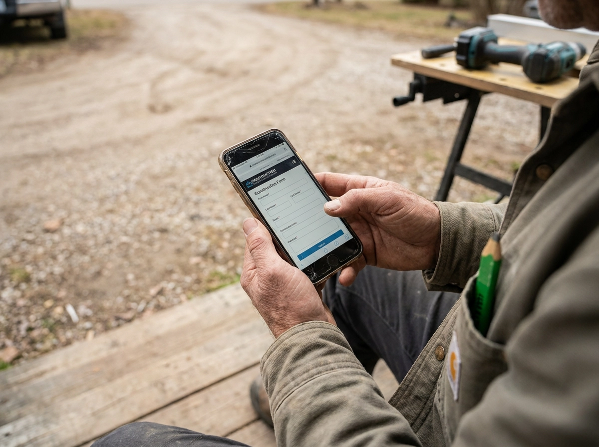
Quote Forms Have to Work on a Job Site
A well-targeted service page still fails if the quote form stops people cold.
Think about who actually fills out quote request forms on a contractor's site. A homeowner standing in their backyard looking at a damaged fence. Someone in a parking lot waiting to pick up their kid, trying to get a roofing estimate started before they forget. These people are on a phone, possibly in weak signal, definitely not sitting at a desktop with two hands free and unlimited patience.
Generic contact forms aren't built for that. They ask for name, email, phone number, a subject line, and a free-text message box. Five fields, no structure, and a keyboard that eats half the screen. Keep fields to the essentials: project type, location, timeline, and preferred contact method, so the form is answerable in under a minute with one thumb.
Every additional field past the essentials adds friction, and on mobile, friction means abandonment. Large tap targets and single-column layouts aren't polish, they're function. Template builders rarely account for one-handed use because they're not designing for service business workflows.
The payoff is real. Frictionless forms paired with strong trust signals can meaningfully lift conversion rates, and form friction is one of the fastest ways to erase the credibility your site spent the whole visit building.
Page Speed Is a Competitive Advantage Contractors Are Leaving Behind

None of the above matters if the page takes eight seconds to load.
Template and DIY page builders ship with every feature they offer loaded by default, whether your site uses those features or not. Sliders you never enabled, font libraries you never touched, ecommerce scripts for a store you don't have. That extra weight slows every page down.
A custom-built contractor website loads only what it actually needs. Leaner code produces faster pages and better scores on Google's Core Web Vitals, the performance metrics Google uses as part of its search ranking evaluation. Faster pages rank better.
For contractors, this matters more than it does for most industries. A large share of contractor website traffic comes from mobile users doing quick searches between tasks. Someone on a lunch break trying to find a roofer is not going to wait. If the page lags, they hit the back button and call whoever loaded first.
There's also a credibility dimension. A slow, janky homepage signals neglect. In an industry where homeowners are handing over serious money and trusting someone to work in their home, a site that can't load quickly raises quiet doubts before a single word is read.
The bloat problem cannot be patched with a plugin. It's structural. You can compress images after the fact, but you can't unload a template's built-in feature set. Not sure what's holding your website back? The only real fix is building lean from the beginning.
The Homepage Has One Job: Move the Visitor Toward a Call
Once a visitor is on your page, the homepage hierarchy determines whether they call or leave.
Generic templates open with a headline like "Building Your Dreams Since 1998" or a full-screen video of a skyline. That's brand storytelling, and it's the wrong move. The best contractor websites skip the narrative and lead with three things in the first viewport: what trade you do, where you do it, and what the visitor should do next.
Homeowners make a fast gut-check when they land on a contractor's site. If they can't confirm your trade, your service area, and some proof of real work within a few seconds, they're gone. That window isn't long. The research on how people read web pages consistently shows that the overwhelming majority of attention goes to content above the fold. Below it is a bonus, not a guarantee.
The hierarchy that actually works looks like this:
Above the fold: Trade and location, clearly stated, plus a visible path to contact
Second section: Trust signals, license number, reviews, years in business
Third section: Project photos that match what the visitor came looking for
Throughout: A consistent, low-friction way to reach you
Template builders have no logic for this sequence. They're built for brand-first storytelling across every type of small business, which means they're optimized for none of them specifically.
A beautiful homepage and a homepage that generates calls are not automatically the same thing. The best contractor websites are built around the second goal.
Build a Website That Does the Job
The problems above share a root cause: templates were never built to solve contractor-specific requirements.
Start with three questions your site needs to answer in the first few seconds: What trade do you do? Where do you work? Have you done it before? If a visitor has to dig for any of those answers, you're losing leads to someone whose site makes it obvious.
A quick audit will tell you where you stand. Pull up your current site on your phone and check:
Is your license number visible without scrolling?
Are your service areas written out as actual city and county names?
Do your project photos show your real work, not stock images?
Can someone submit a quote request with one hand in under a minute?
If any of those answers are no, you have a concrete problem with a concrete fix.
That competitive gap hasn't closed. A purpose-built site that does its job creates visible distance from that majority without requiring a massive marketing budget.
If you want a contractor website built from scratch, no templates and no bloat, Warped Web Studio builds sites structured around one outcome: getting your phone to ring. Reach out when you're ready to talk through what that looks like for your business.
Conclusion
The contractors who pull ahead won't necessarily spend more, they'll start with a foundation built for their trade. Run the audit, find the gaps, fix them with intention. Your next customer is searching right now.